# 文章目录
- 一、盒子模型
- 二、使用 margin 实现居中效果
- 三、外边距合并与负值
- 四、内边距
- 五、边框
- 六、轮廓线 outline
- 七、元素的显示与隐藏
- 八、内容处理
- 九、自适应尺寸 fill-availavle 和 fit-content
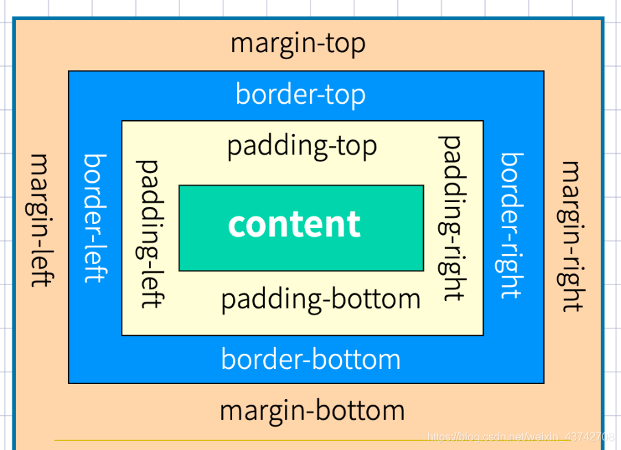
# 一、盒子模型
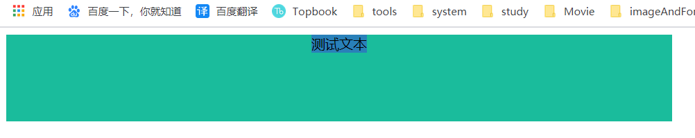
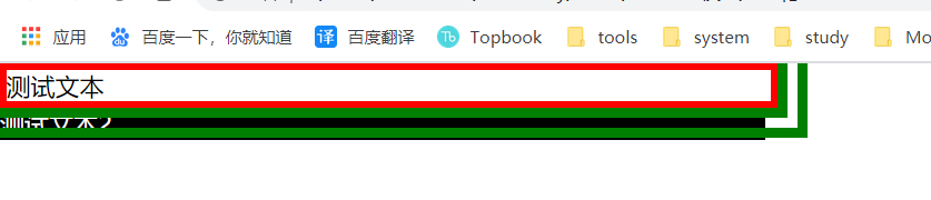
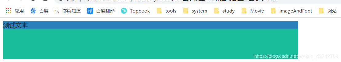
# 二、使用 margin 实现居中效果
注意:在使用 margin 实现居中的时候 需要对 当前元素设置 width 属性,不然无效
实例:
<style>
  main {
    border: 1px solid teal;
  }

  h2 {
    width: 40vw;
    border: 1px solid red;
    margin: 0 auto;
  }
</style>
<body>
  <main>
    <h2>测试文本</h2>
  </main>
</body>
2
3
4
5
6
7
8
9
10
11
12
13
14
15
16
效果:

# 三、外边距合并与负值
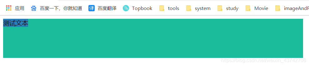
# 3.1 外边距负值
<style>
  main {
    width: 50vw;
    margin: 0 auto;
    border: 1px solid teal;
    padding: 50px 0px;
  }

  h2 {
    border: 1px solid red;
    margin-left: -50px;
  }
</style>
<body>
  <main>
    <h2>测试文本</h2>
  </main>
</body>
2
3
4
5
6
7
8
9
10
11
12
13
14
15
16
17
18
效果:

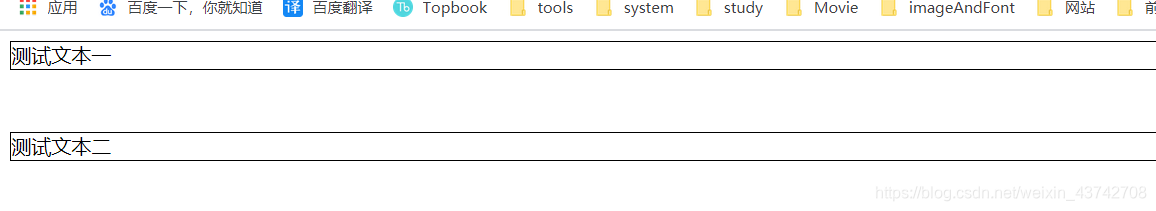
# 3.2 外边距塌陷
外边距塌陷是指同级的兄弟元素如果上一个设置下边距。下一个设置上边距的话 边距会合并 取最大的那个。
PS:兄弟标元素 上下边距同时存在时,会取最大的那个。
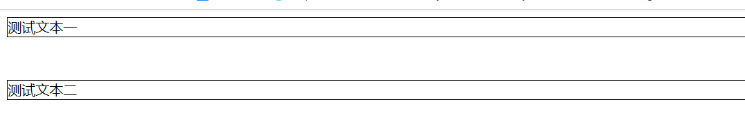
先来看看只设置一个的情况:
<style>
  div {
    border: 1px solid black;
  }
  div:nth-of-type(1) {
    margin-bottom: 50px;
  }
</style>
<body>
  <div>测试文本一</div>
  <div>测试文本二</div>
</body>
2
3
4
5
6
7
8
9
10
11
12
效果:
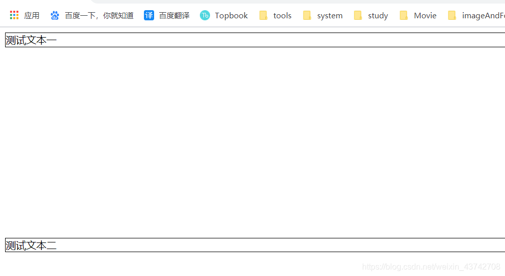
看起来没有什么问题,正常的对吧,接下来我们给第二个 div 设置上边距:
<style>
  div {
    border: 1px solid black;
  }
  div:nth-of-type(1) {
    margin-bottom: 50px;
  }
  div:nth-of-type(2) {
    margin-top: 50px;
  }
</style>
<body>
  <div>测试文本一</div>
  <div>测试文本二</div>
</body>
2
3
4
5
6
7
8
9
10
11
12
13
14
15
效果:
是不是惊呆了,是不是没有任何变化? 这就对了,这是因为发生了外边距塌陷,也就是外边距合并。
接下来我们把第二个 div 的margin-top加大试试:
    <style>
        div{
            border: 1px solid black;
        }
        div:nth-of-type(1){
            margin-bottom: 50px;
        }div:nth-of-type(2){
            margin-top: 300px;
        }
    </style>
2
3
4
5
6
7
8
9
10
可以发现 div 又往下靠了,这就是外边距塌陷时,系统会取最大的那个值的情况。
为什么会出现这种情况了,其实这种情况是故意为之的,方便我们排版文章,比如:
当我们对li只设置下边距时:
<style>
  ul,
  li {
    border: 1px solid black;
    margin-bottom: 20px;
  }
</style>
<body>
  <ul>
    <li>文章1</li>
    <li>文章2</li>
    <li>文章3</li>
  </ul>
</body>
2
3
4
5
6
7
8
9
10
11
12
13
14
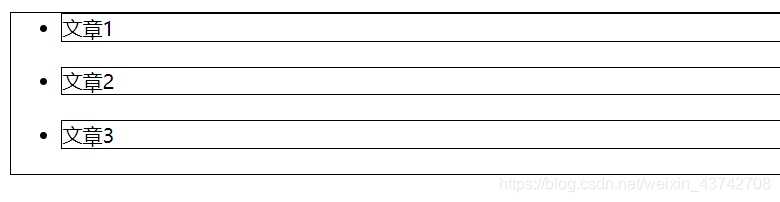
可以发现第一个li距离顶部是贴紧的,我们还需要单独对第一个 div 设置上边距等情况。
而如果同时设置上下边距:
<style>
  ul,
  li {
    border: 1px solid black;
    margin: 20px 0px;
  }
</style>
2
3
4
5
6
7
效果:
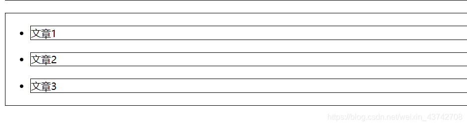
是不是就很棒!
# 四、内边距
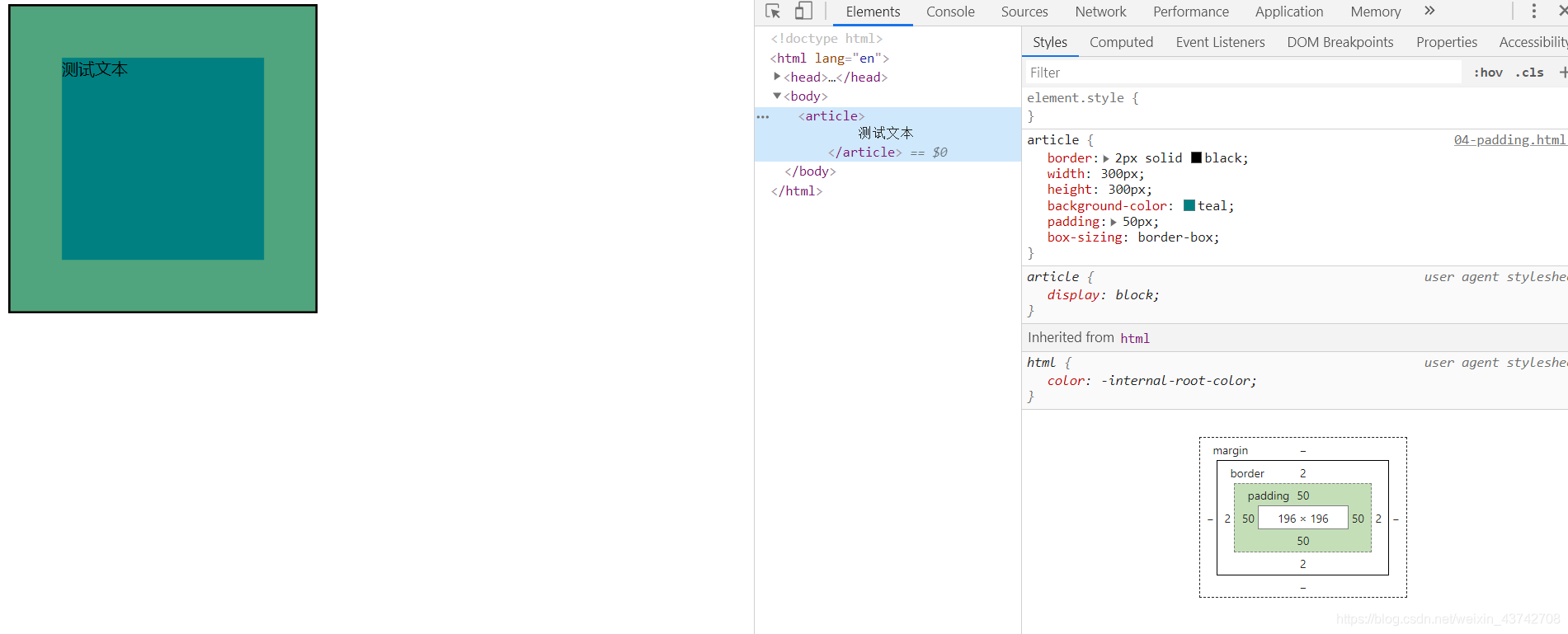
# 4.1 box-sizing:border-box
该属性规定盒子的大小为指定宽度,如果有 paading 或者 border 时,指定的 width 会相应的减少。
也就是说 设置了该属性后,再设置 border 或者 padding 不会对元素的总体宽度产生影响。
没有设置该属性时:
<style>
  article {
    border: 2px solid black;
    width: 300px;
    height: 300px;
    background-color: teal;
    padding: 50px;
  }
</style>
<body>
  <article>
    测试文本
  </article>
</body>
2
3
4
5
6
7
8
9
10
11
12
13
14
效果:

可以发现 DIV 被撑大了。
设置该属性时:
<style>
  article {
    border: 2px solid black;
    width: 300px;
    height: 300px;
    background-color: teal;
    padding: 50px;
    box-sizing: border-box;
  }
</style>
2
3
4
5
6
7
8
9
10
可以发现 div 没有被撑大!
在布局时如果希望元素的尺寸是固定的,那么可以使用该属性。
注意:如果 当padding+border 大于 width/2时,该属性会失效。
# 五、边框
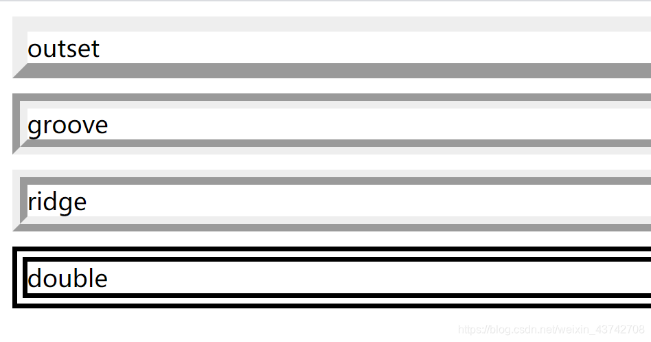
# 5.1 border-style
主要看一下特殊边框线的样式:
<style>
  article {
    margin: 10px 0;
  }
  article:nth-child(1) {
    border: 10px solid;
    border-style: outset;
  }
  article:nth-child(2) {
    border: 10px solid;
    border-style: groove;
  }
  article:nth-child(3) {
    border: 10px solid;
    border-style: ridge;
  }
  article:nth-child(4) {
    border: 10px solid;
    border-style: double;
  }
</style>
<body>
  <article>
    outset
  </article>
  <article>
    groove
  </article>
  <article>
    ridge
  </article>
  <article>
    double
  </article>
</body>
2
3
4
5
6
7
8
9
10
11
12
13
14
15
16
17
18
19
20
21
22
23
24
25
26
27
28
29
30
31
32
33
34
35
效果;
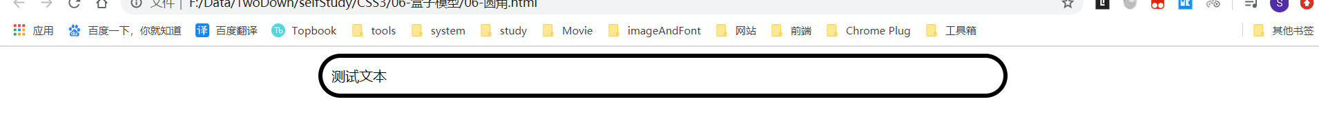
# 5.2 圆角 border-radius
# 5.2.1 基本使用:
<style>
  article {
    width: 50vw;
    padding: 10px;
    margin: 0 auto;
    border: 5px solid black;
    border-radius: 30px;
  }
</style>
<body>
  <article>
    测试文本
  </article>
</body>
2
3
4
5
6
7
8
9
10
11
12
13
14
效果:
# 5.2.2 单独控制某一边:
<style>
  article {
    width: 50vw;
    padding: 10px;
    margin: 0 auto;
    border: 5px solid black;

    border-top-left-radius: 30px;
    border-top-right-radius: 30px;
    border-bottom-right-radius: 30px;
    border-bottom-left-radius: 30px;
  }
</style>
<body>
  <article>
    测试文本
  </article>
</body>
2
3
4
5
6
7
8
9
10
11
12
13
14
15
16
17
18
效果:

我们发现同样可以实现一样的功能,不过明显上边简洁好多。
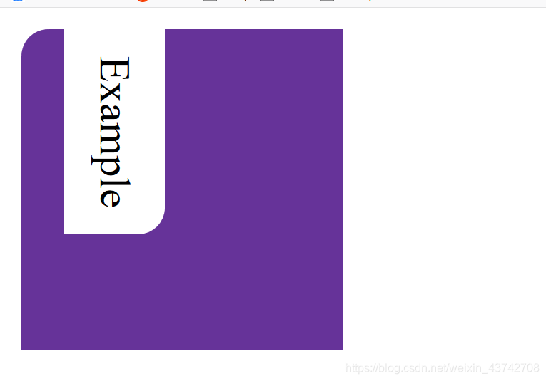
此外,还有border-[satart,end]-[start,end]-radius这种写法,不过只有 FireFox 支持,这里就不做说明了,有兴趣可以去看看。
MDN:border-start-start-radius (opens new window)
<style>
  div {
    background-color: rebeccapurple;
    width: 120px;
    height: 120px;
    border-start-start-radius: 10px;
  }

  .exampleText {
    writing-mode: vertical-rl;
    padding: 10px;
    background-color: #fff;
    border-start-end-radius: 10px;
  }
</style>

<body>
  <div>
    <p class="exampleText">Example</p>
  </div>
</body>
2
3
4
5
6
7
8
9
10
11
12
13
14
15
16
17
18
19
20
21
注意:请在 FireFox 浏览器运行以上代码。
# 六、轮廓线 outline
注意:轮廓线不占用空间位置
outline-color:
outline-style:
outline-width:
可以合并为 outline: color style width
基本使用:
<style>
  * {
    margin: 0;
    padding: 0;
    width: 500px;
  }
  article {
    border: 4px solid red;
    outline: 20px double green;
  }
  div {
    background-color: black;
    color: white;
  }
</style>
<body>
  <article>
    测试文本
  </article>
  <div>测试文本2</div>
</body>
2
3
4
5
6
7
8
9
10
11
12
13
14
15
16
17
18
19
20
21
效果:
此外,在我们的 input 框中,当我们获取到焦点时,会有一个淡蓝色的边框,我们可以使用这个属性去掉。
没有去掉时:
去掉后:
<style>
	input:focus{
	    outline: none;
	}
</style>
2
3
4
5
# 七、元素的显示与隐藏
其他参考:元素显示隐藏的 9 种思路 (opens new window)
# 7.1 display
display:none 即可让元素隐藏,并且不占用空间位置。
# 7.2 visibility
visibility: hidden 元素隐藏,但是还是会占用空间位置。
# 7.3 opacity
opacity:0 元素透明度为 0,即不显示,会占用空间位置。
# 7.4 overflow
设置其父级的 overflow:hidden
CSS 中有一个属性是 overflow,overflow:hidden 代表着溢出隐藏。我们可以利用父级的 overflow:hidden 配合父级的 height:0 或 width:0 来实现元素的显隐
注意:当设置 overflow 的元素在绝对定位元素和其包含块之间的时候,overflow 属性会失效
# 八、内容处理
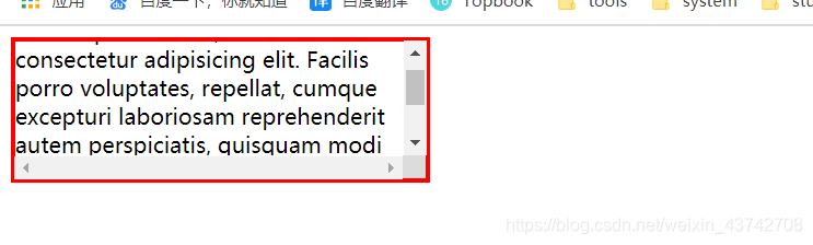
# 8.1 内容溢出处理 overflow
| 值 | 描述 |
|---|---|
| visible | 默认值。内容不会被修剪,会呈现在元素框之外。 |
| hidden | 内容会被修剪,并且其余内容是不可见的。 |
| scroll | 不管内容是否溢出都出现滚动条 |
| auto | 只有当内容溢出才出现滚动条 |
| inherit | 规定应该从父元素继承 overflow 属性的值。 |
注意:部分机型 UI 可能会有差异。
基本使用:
<style>
  div {
    border: 3px solid red;
    width: 300px;
    height: 100px;
    overflow: auto;
  }
</style>
<body>
  <div>
    Lorem ipsum dolor, sit amet consectetur adipisicing elit. Facilis porro
    voluptates, repellat, cumque excepturi laboriosam reprehenderit autem
    perspiciatis, quisquam modi voluptatem dolores corrupti voluptas.
    Exercitationem enim odit unde? Illo, alias!
  </div>
</body>
2
3
4
5
6
7
8
9
10
11
12
13
14
15
16
效果:
# 8.2 最小 最大 宽高
min-width
min-height
max-width
max-height
<style>
    div{
        width: 300px;
        height: 300px;
        border: 3px solid #ccc;
    }
    div img{
        max-width: 90%;
        min-width: 50%;
    }

</style>
<body>
    <div>
        <img src="../image/1.png" alt="">
    </div>
</body>
2
3
4
5
6
7
8
9
10
11
12
13
14
15
16
17
效果;
# 九、自适应尺寸 fill-availavle 和 fit-content
# 9.1 自动撑满可用宽高 -webkit-fill-available
注意: IE 浏览器不支持,webkit 内核浏览器需添加-webkit-前缀
<style>
  main {
    width: 50vw;
    height: 100px;
    background-color: #1abc9c;
  }
  div {
    background-color: #34495e;
  }
</style>
<body>
  <main>
    <div>
      测试文本
    </div>
  </main>
</body>
2
3
4
5
6
7
8
9
10
11
12
13
14
15
16
17
效果:
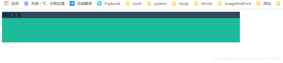
这时我们发现父级main元素还有空间供div使用,我们可以使用 -webkit-fill-available属性使用可用空间。
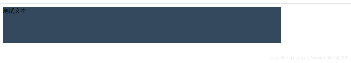
<style>
  main {
    width: 50vw;
    height: 100px;
    background-color: #1abc9c;
  }
  div {
    background-color: #34495e;
    height: -webkit-fill-available;
  }
</style>
2
3
4
5
6
7
8
9
10
11
效果:
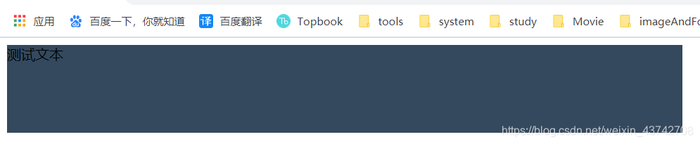
行级元素使用时:
<style>
  main {
    width: 50vw;
    height: 100px;
    background-color: #1abc9c;
  }
  span {
    background-color: #34495e;

    display: inline-block;
    width: -webkit-fill-available;
    height: -webkit-fill-available;
  }
</style>
2
3
4
5
6
7
8
9
10
11
12
13
14
# 9.2 根据内容自适应宽高 fit-content
注意: IE 浏览器不支持,webkit 内核浏览器需添加-webkit-前缀
可以搭配:max-width 使用,如:max-width:fit-content。
此外还有max-content和min-content。
min-content
width:min-content 表示采用内部元素最小宽度值的那个元素的宽度作为最终容器的宽度
首先,要明白这里的“最小宽度值”是什么意思。替换元素,例如图片的最小宽度值就是图片呈现的宽度,对于文本元素,如果全部是中文,则最小宽度值就是一个中文的宽度值;如果包含英文,因为默认英文单词不换行,所以,最小宽度可能就是里面最长的英文单词的宽度
max-content
width:max-content 表示采用内部元素宽度值最大的那个元素的宽度作为最终容器的宽度。如果出现文本,则相当于文本不换行
初始代码:
<style>
  main {
    width: 50vw;
    height: 100px;
    background-color: #1abc9c;
  }
  div {
    background-color: #2980b9;
    width: fit-content;
  }
</style>
<body>
  <main>
    <div>
      测试文本
    </div>
  </main>
</body>
2
3
4
5
6
7
8
9
10
11
12
13
14
15
16
17
18
效果:
当我们添加自动适应 fit-content 时:
<style>
    main{
        width: 50vw;
        height: 100px;
        background-color: #1abc9c;
    }
    div{
        background-color: #2980b9;
        width: fit-content;
    }
</style>
2
3
4
5
6
7
8
9
10
11
效果;
此时我们还可以使用 margin:0 auto 使其居中。
<style>
    main{
        width: 50vw;
        height: 100px;
        background-color: #1abc9c;
    }
    div{
        background-color: #2980b9;
        width: fit-content;
        margin: 0 auto;
    }
</style>
2
3
4
5
6
7
8
9
10
11
12
效果: